If you’re new to dashboards there may be a lot of jargon and acronyms that you’re not overly familiar with. This blog post will cover some of the most commonly used phrases, terms, and acronyms when it comes to dealing with dashboards.
Annotations – In dashboarding, annotations are comments attached to individual data visualizations. They are intended to add context or provide additional information for other dashboard users. An example is when a user adds a personalized remark to a data point or series on the dashboard to give background information or to raise concerns.
BI – or Business Intelligence: Business Intelligence encompasses many different concepts and technologies that help facilitate a better understanding of an organization’s place within its commercial context. Its goal is to gather, store, analyze and share data to help make better/smarter business decisions. Simply put the purpose of BI is to turn information into action.
Big Data – Gartner defines big data as "high-volume, high-velocity and high-variety information assets that demand cost-effective, innovative forms of information processing for enhanced insight and decision making" (source).
BPM / CPM – Business Performance Management or Corporate Performance Management: Gartner defines this as "an umbrella term that describes the methodologies, metrics, processes and systems used to monitor and manage the business performance of an enterprise." (source).
BSC – Balanced Scorecards: incorporate the concept of managing metrics and using visualizations while combining this task with overall strategic goal alignment. A good example is the use of balanced scorecards to manage the organization’s financial metrics with internal business processes, general goals and external factors, such as goals related to customers.

Scorecard example
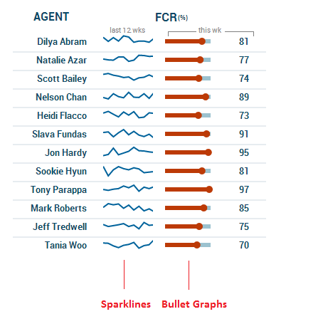
Bullet graphs – a variation of a linear gauge developed by dataviz guru, Stephen Few. The bullet graph features a single, primary measure (ex. current month-to-date revenue or output), compares that measure to a target or treshold (e.g. target sales) to enrich its meaning, and displays it in the context of qualitative ranges of performance, such as poor, satisfactory, and good.

Bullet graph sample - courtesy of Perceptual Edge
Dataviz – abbreviation for data visualization. It is typically seen as the presentation layer for business intelligence or information presentation. Data visualization can take the form of a dashboard, chart/graph, scorecard, report, infographic, etc.
Drill-down - also referred to drill-through this refers to the action of clicking on an actionable item (bar, data point/series, icon, etc.) and pulling up more detailed information related to that item. Examples of what users typically "drill into" include other dashboards, reports, or data sheets.
Histogram – a graphical representation of the distribution of data. Iit is a column or bar chart which is used to show the distribution of data, with the X-axis broken into discrete ranges or "buckets" (one column per bucket). See the example below:

Histogram example
KPIs – or Key Performance Indicators: A significant metric or piece of data that measures business performance. KPIs differ depending of the nature of the organization and its strategy and goals; they can greatly influence the success and/or failure of an organization, department or project.
Metrics – a number without bias.
Mobile BI – Mobile business intelligence refers to the use of business intelligence on mobile devices such as smart phones and tablets.
OLAP – OnLine Analytical Processing: is an approach to answering multi-dimensional analytical queries swiftly. OLAP tools enable users to analyze multidimensional data interactively from multiple perspectives. OLAP consists of three basic analytical operations: consolidation (roll-up), drill-down, and slicing and dicing. Consolidation involves the aggregation of data that can be accumulated and computed in one or more dimensions. For example, all sales offices are rolled up to the sales department or sales division to anticipate sales trends. By contrast, the drill-down is the opposite of consolidation and is a technique that allows users to navigate through the details. Slicing / dicing is where an end user analyzes data across multiple perspectives / dimensions, most often using a simple interface (although manually authoring MDX queries is also part of this).
Predictive Analytics – covers a variety of techniques from statistics, modeling, machine learning, and data mining that analyze current and historical facts in order to make predictions about future, or unknown, events.
Sparklines – first introduced by Edward Tufte, sparklines are data-intense, design-simple, word-sized graphics that resemble small line graphs. You generally use a sparkline when displaying trends or data over time. Take a look at the example below.
Sparkline example
Have any others you would like us to add? Let us know in the comments section.