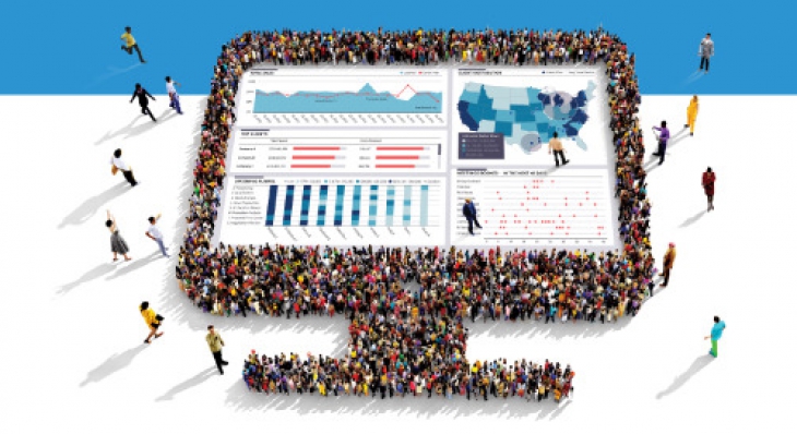
Dashboard adoption is still the biggest challenge there is when it comes to delivering a dashboard.
It doesn’t matter how hard you worked to get your data, define your metrics and implement your dashboard, at the end of the day, if only a few people are using it, it’s not going to be very valuable. Unfortunately there are many factors that can bring down your dashboard adoption rate. However, if your dashboard has the following “3 musts” – you shouldn’t worry about your adoption – it will come naturally.
1. Design
The visual appearance of your dashboard is the first thing that gets noticed when someone looks at your dashboard. Your dashboard should be beautiful in order to pass that test. If you show an executive a “half-baked” dashboard, odds are that you will never have the chance to correct your first impression, and that dashboard will always be perceived as less appealing to that executive. At the end of the day, dashboards are designed to communicate information to humans and humans are emotional creatures. Your design has a great impact on the consumer of it. That doesn’t mean that you should now start mixing in a bunch of competing chart types and visuals just to make it look “interesting”, but it does mean you need to put some thought and time into how to turn your dashboard into a professional looking tool that is pleasing to look at. If you don’t have design skills, try using a graphic designer. If you don’t have access to a graphic designer, you can start here, with an article on the Seven Deadly Sins of Dashboard design. You should also consider getting a second eye on your dashboard before you present it. And no, using the same defaults templates that your tool offers has been done before and will typically not impress users looking at your dashboard.
2. Content
After the initial excitement you may be able to generate with a good design, to make sure your users keep on using the dashboard over time you must have the right content in it. That means it needs to include information (indicators/metrics) that users care about. If the dashboard shows data that doesn’t impact the users in one way or another, then it will be quickly left unused even if it’s the prettiest dashboard ever created. Make sure you use actionable Key Performance Indicators (KPIs) and not just Key Result Indicators (KRIs) on your dashboard. It must give users data they can use in their decision making process or data they relate to emotionally. For example - “how many deals we closed this month” – everybody cares about that…
3. Experience
If content is king, experience is queen. The experience starts with how easy it is for the users to access your dashboard (hint – it won’t be adopted if it only demos nicely on your desktop, but can’t be easily accessed in the same way from their own tablet or laptop). Once a user accesses your dashboard, the flow of the information should be natural. He should be able to drill down where he feels the need, get the additional info required in the tool tips, and feel like it is an effortless exercise to get the data he wants. The clicks/hovers, and any other interaction you place on the dashboard, should be intuitive and easy to use. For example, a click on a data point should impact only related data and that impact should be noticeable to the user. The location of the click matters as well – if your filter only applies to one visualization, the filter should be placed next to that visual and not be grouped with all the other filters that affect the entire dashboard. You know your experience is good if your dashboard doesn’t require any training for the users to start using it.
If your dashboard includes these 3 “must haves” – you can expect high adoption rates. Don’t forget to make sure you have a way to track it too. A good exercise to ensure you have it all is to show the dashboard to someone that isn’t related to the project– if he/she likes it and can understand it, then you are on the right track to getting more people using and benefitting from your creation.
