Working with gauges
1. Overview
A gauge is typically used to visualize metrics having a single value, such as the total revenue for the year-to-date compared with this time last year. In other words, gauges are not designed to display multiple rows of data as in a chart or table, but can display multiple measure values.
There are both linear and radial (circular) gauge types available in a variety of configurations.
2. Elements of a gauge
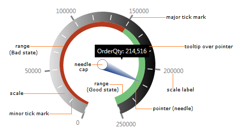
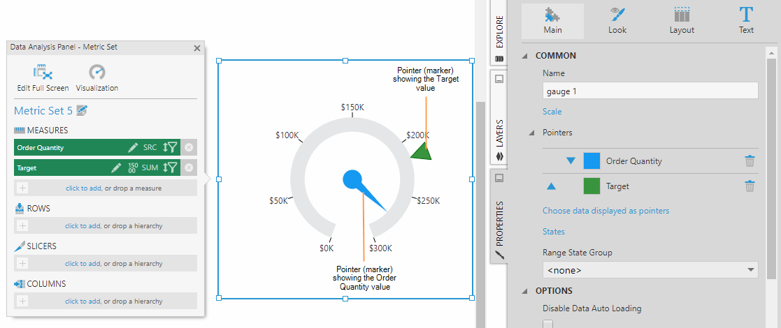
The figure below shows the main elements of a gauge visualization.
3. Types of gauges
3.1. Linear gauge
A linear gauge is characterized by a scale drawn as a straight line with either a horizontal or vertical orientation.
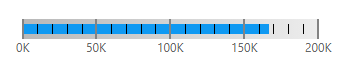
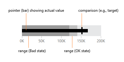
3.2. Bullet graph
A bullet graph is a variation of a linear gauge that follows a particular design meant to emphasize readability and efficient use of space while allowing for meaningful context around the main value. You can use a series of bullet graphs in a relatively compact space to visualize and evaluate a number of key metrics.
3.3. Radial gauge
A radial gauge has a pivot point around which its pointers rotate, plus a circular scale.
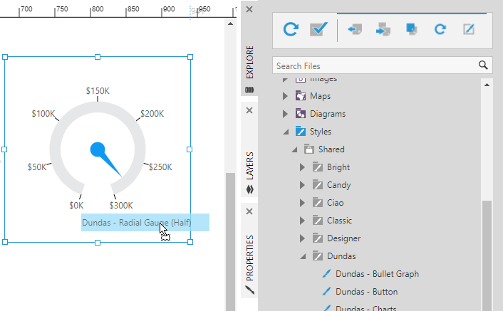
By default, the radial scale forms an almost complete circle with a sweep angle of 320 degrees, but you can easily adjust its start and sweep angles to any combination of degrees to form an arc (for example), or apply one of Dundas BI's built-in styles that provide Half and Quarter gauges.
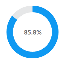
3.4. Pie gauge
A pie gauge is a variation on a radial gauge that displays a metric as a percentage of the length of a circular scale, like a pie or donut chart with a single slice.
4. Adding a gauge
The following is a brief walkthrough that shows you how to add a gauge to your dashboard.
First, create a new dashboard from the main menu and use the Blank template.
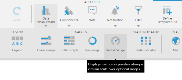
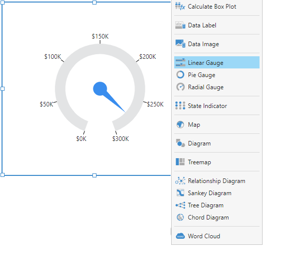
Go to the toolbar, click Data Visualization, scroll to the right, and click Radial Gauge.
This adds an empty radial gauge to the canvas with its Data Analysis Panel open.
Go to the Explore window and locate a measure column you want to visualize. Drag the measure onto the empty gauge.
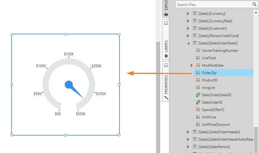
A basic radial gauge is displayed which includes a pointer (of type Needle), a scale with labels, and major tick marks.
Radial and pie gauges have built-in styles available that offer different predefined layouts, such as quarter radial gauges and filled pie gauges. In the Explore window, expand the Styles and Shared folders to look through the different styles available for each theme, then drag a style onto a compatible gauge to apply it.
Right click on the radial gauge, click Re-visualize, and then select Linear Gauge.
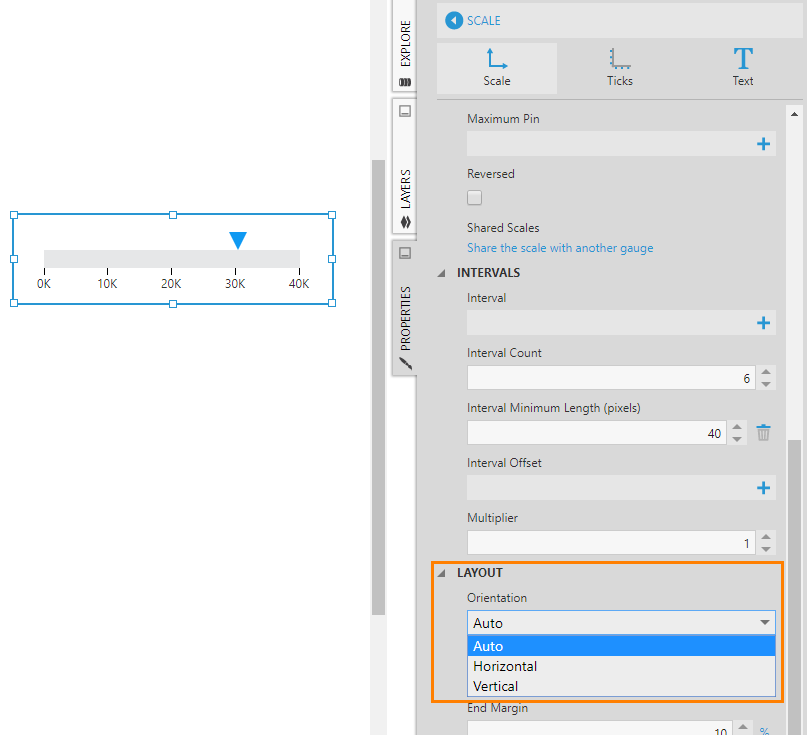
This turns it into a linear gauge. Depending on its dimensions, the scale of the linear gauge will be oriented horizontally or vertically. This is because the gauge scale's Orientation property is set to Auto by default.
5. Scale
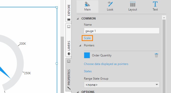
You can access the properties of a gauge scale from the Main tab in the Properties window.
You can also right-click on a scale element such as a label to open its properties, or click on it if the gauge's properties are already open to switch to the scale properties.
5.1. Start and sweep angle
By default, the scale of a radial gauge forms a nearly 360-degree circle. You can change the start and sweep angles of the gauge's scale to have the gauge display as an arc (i.e., a partial circle).
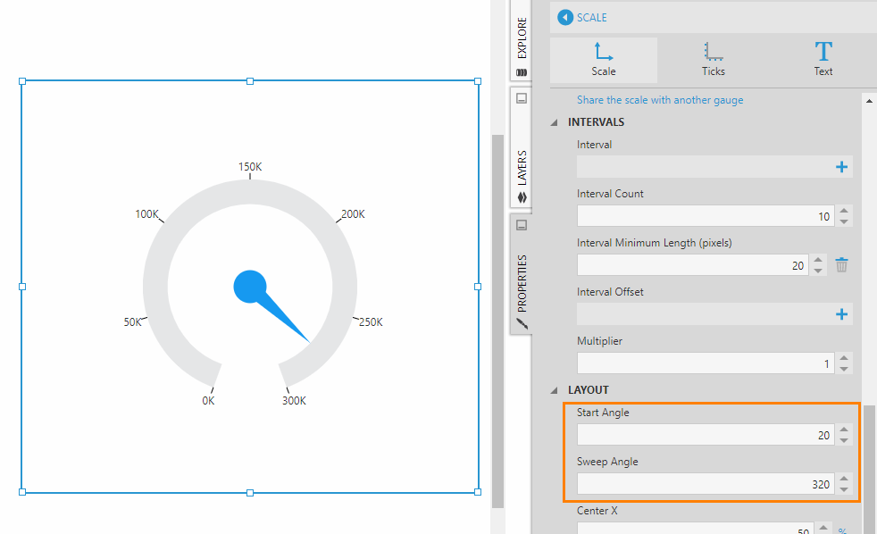
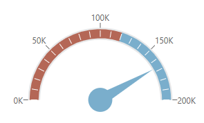
The gauge's Start Angle property specifies the angle at which to start drawing the scale. This is an angle in degrees between 0 and 360, which is measured clockwise from the 6 o'clock position. For example, to produce the semi-circular radial gauge shown at the beginning of this article, set the start angle to 90 degrees.
The Sweep Angle property is an angle representing the length of the arc and is measured in degrees. For example, to produce the semi-circular radial gauge shown at the beginning of this article, set the sweep angle to 180 degrees.
If you decrease the sweep angle below 270 degrees, you may want to position and size the scale to take up more space within the bounds of the gauge. For example, set Center X and Center Y to adjust the scale's position by its center. Then set Radius to adjust the size of the scale.
5.2. Minimum and maximum
The scale's minimum and maximum values are determined automatically based on the gauge's underlying data. However, you can override this by setting the gauge scale's Minimum and/or Maximum properties manually.
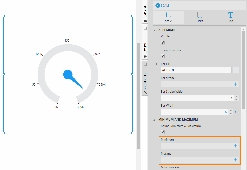
If the Minimum and Maximum properties are not set on a gauge scale, and the Round Minimum & Maximum property is turned on, then rounded values for the scale minimum and maximum will be calculated automatically.
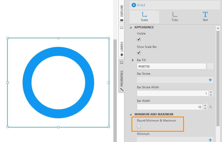
For pie gauges, which do not display any scale labels, the Round Minimum & Maximum property is turned off by default because rounding can be misleading. Instead of using rounding, you can do one of the following for a pie gauge:
- Set up states which are displayed as ranges on the gauge
- Add a second measure which will be displayed as a second pointer (e.g., a target)
- Set the Maximum property manually
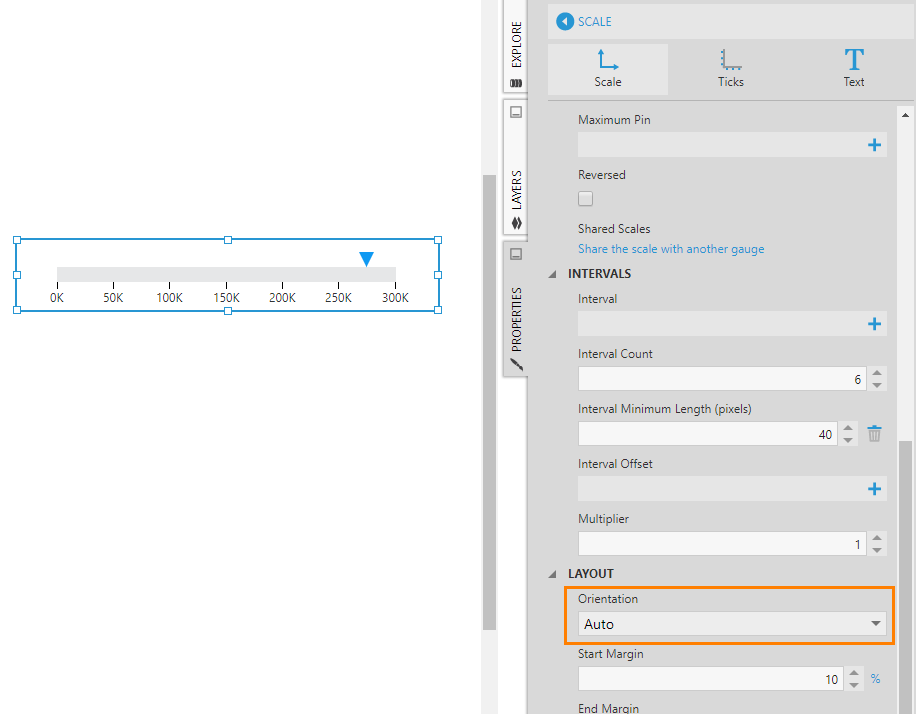
5.3. Orientation
As shown in the walkthrough, use the gauge scale's Orientation property to orient a linear gauge horizontally or vertically. By default, this property is set to Auto, which means the orientation is adjusted automatically based on the width and height of the gauge.
5.4. Interval and interval count
The Interval and Interval Count properties can be set on a scale itself, or on its major tick marks, minor tick marks, or labels.
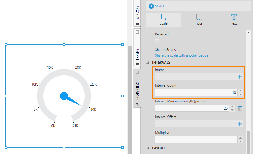
By default, the Interval Count on the scale is set to 5 which means the scale is divided into 5 sections.
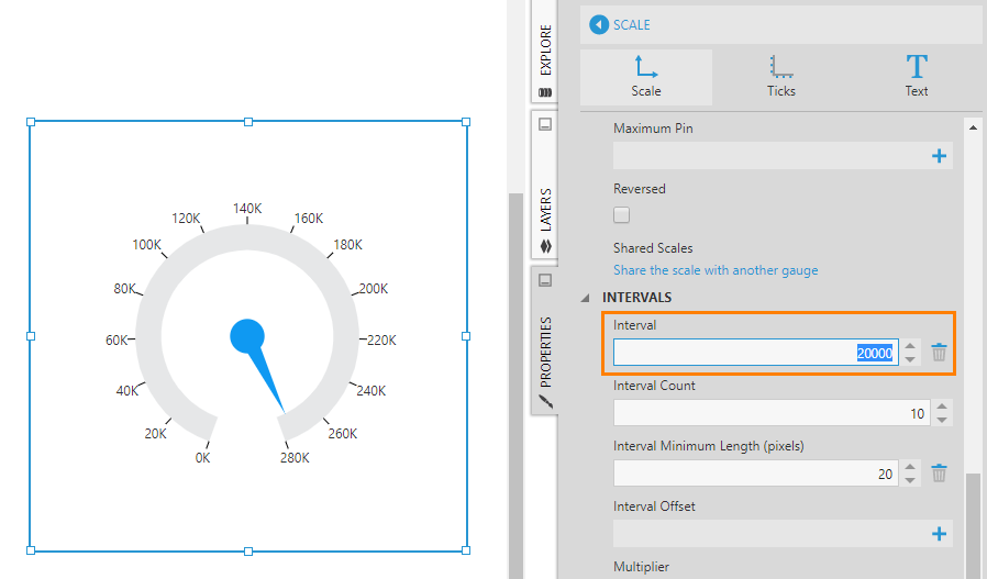
The Interval property lets you override the interval count by specifying the size of each interval based on measure units. For example, in the figure below, the interval is set to 20,000 and the total number of intervals is determined automatically based on that value.
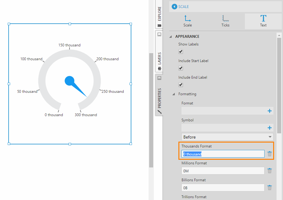
5.5. Label style
To customize gauge labels, go to the Properties window for the scale series, click the Text tab.
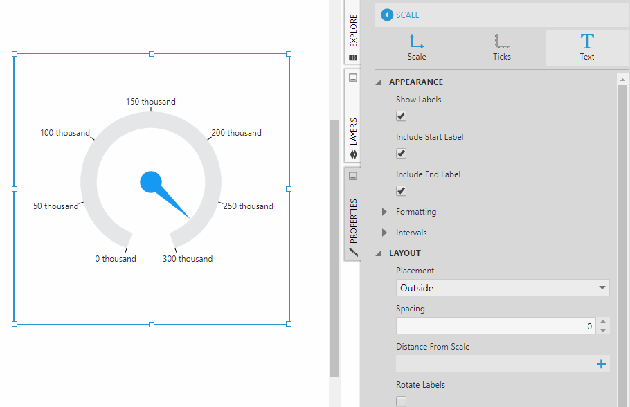
For example, go to the Text tab to change how you want large numeric values to be formatted. (But note that the defaults are already set up to generate compact labels and avoid overlap when displaying large values.)
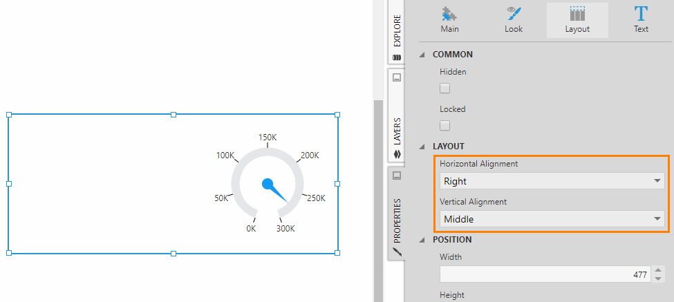
5.6. Alignment
By default, a radial gauge is centered within its rectangular bounds when its width and height are not the same. You can change this by going to the Layout properties for the gauge and using the Horizontal Alignment and Vertical Alignment properties to align it as needed.
6. Pointers
A gauge has one or more pointers which correspond to the measures from a metric set. A second pointer is often used in gauges to represent a target measure or contextual metric value. Each pointer can be independently customized in terms of appearance and layout.
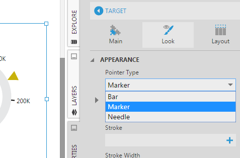
6.1. Pointer type
The Pointer Type property has 3 options: Bar, Marker, and Needle. A radial gauge can use any of these pointer types but a linear gauge only supports Bar and Marker.
Note that a bar pointer is not visible when its value is zero.
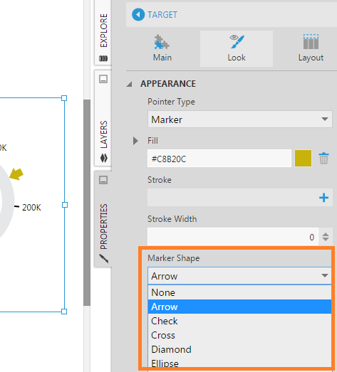
6.2. Marker shape
If your pointer type is Marker, use the Marker Shape property to choose between a number of available shapes.
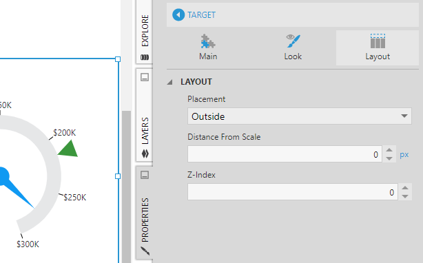
6.3. Placement
Go to the Layout section of a pointer's properties to find the Placement property. Use this property to control whether the pointer (e.g., marker) should be placed on the inside or outside of the scale, or placed in the center of the scale.
7. Ranges
Gauge ranges display states from your metric set's state group. Showing ranges on a gauge helps users to quickly identify the condition of the measure being monitored.
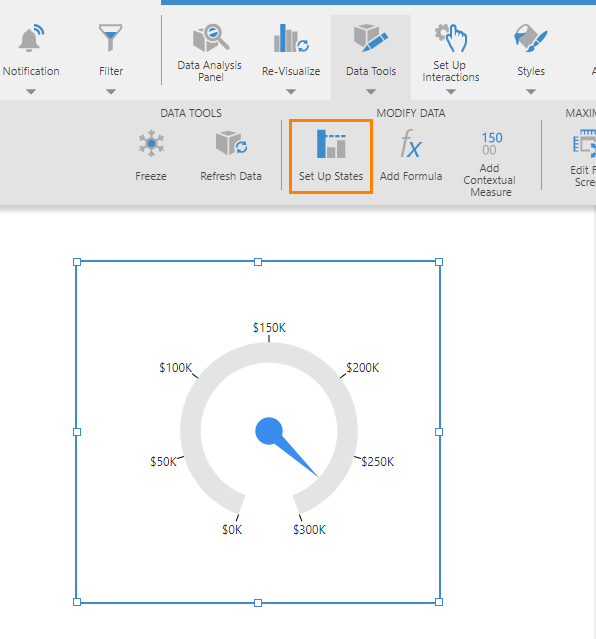
7.1. Set up states
To set up states for a gauge on a dashboard or other view, select the gauge on the canvas, go to the toolbar, click Data Tools, and then click Set Up States. (For a full screen metric set, click Set Up States in the toolbar.)
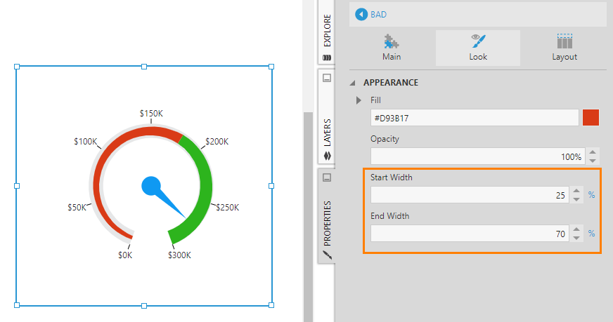
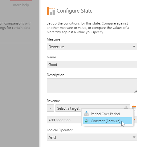
Set Measure to your main measure, then add states that describe ranges of values in a meaningful way. For example, add a Good state and a Bad state that each compare against a Constant (Formula) value of 150000 but with a different operator (i.e., click the Greater Than sign and choose one).
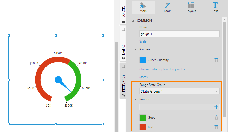
7.2. Range state group
Next, go to the properties for the gauge. On the Main tab, set the Range State Group property to State Group 1 which is the state group that was just created.
Ranges are automatically added to the gauge with default colors.
7.3. Start and end width
In the Properties for the gauge, on the Main tab, you'll see a list of ranges corresponding to the states (e.g., Good and Bad). Click on a range to edit its appearance.
For example, change the fill color, Start Width, and End Width of the two ranges to achieve the look shown in the figure below.