
Adding a data label
1. Overview
A data label is a data-driven text label that you can add to views including dashboards and reports.
Data is also visualized as text using a data label automatically when you drag it directly onto a report, scorecard, or small multiple.
2. On a dashboard
As an example, create a new dashboard based on the Blank template.
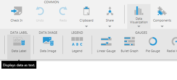
Click Data Visualization in the toolbar, then click Data Label.
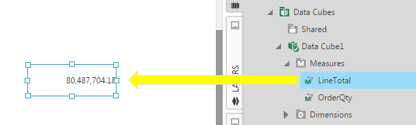
From the Explore window, drag a column, measure, or hierarchy and drop it onto the empty data label.
You can format measures using metric set options in the Data Analysis Panel, which you can open from the toolbar or context menu.
Click the LineTotal measure to edit it and click Define text formatting. Type $ in the Symbol field.
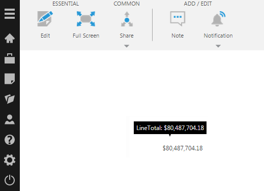
Submit the dialogs and switch to View mode, where you can hover over the text (or long-tap) to see its tooltip.
When adding more than one column, measure, or hierarchy to a data label, you can customize which ones are displayed in its text and tooltip in the Data Analysis Panel's Visualization tab.
3. In reports, scorecards, and small multiples
While designing a report, scorecard, or small multiple, drag any column, measure, or hierarchy from the Explore window to any region.
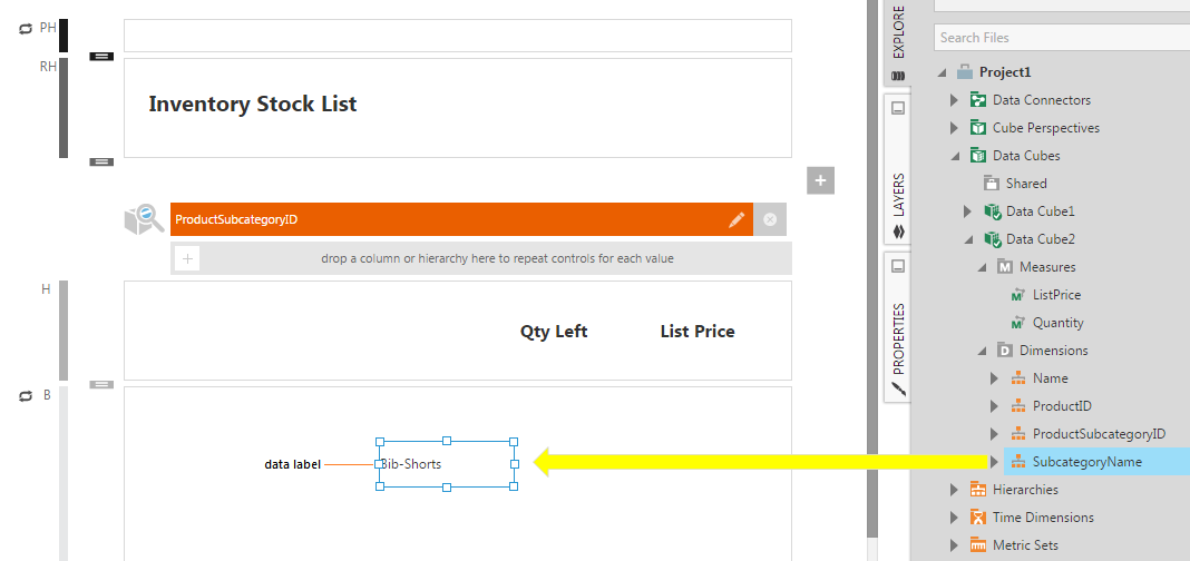
The data will automatically appear as text in a data label.
You can also add a data label yourself from the toolbar and then add data, the same way as described above for dashboards.
4. Properties
4.1. Text and tooltip
You can further customize how text appears in the data label and its tooltip in the Properties window's Text tab, using the Label Text and Tooltip Text properties.
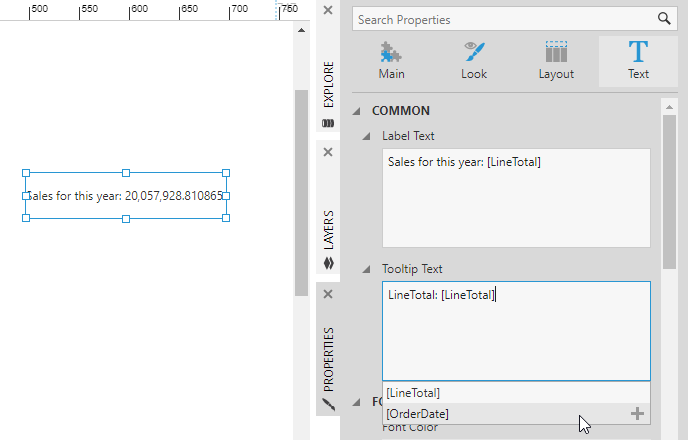
You can combine values from your data with regular text using keywords in square brackets as placeholders for the data, as suggested in the dropdown that appears while editing the text.
Custom formats can optionally be added to the keywords as described in Formatting text.
4.2. Padding
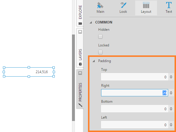
Click Layout and expand the Padding property. This property is useful for lining up data labels and static labels (which also have this property) in the repeating body of a scorecard or report.
4.3. Animation
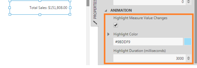
When a measure displayed by a data label changes value (e.g., at the data source), the data label can be animated with a highlight color for a brief duration. This can help bring the data change to the attention of the user.
To use this feature, open the Data Analysis Panel for the data label and click Edit. Make sure the Bypass Data Cache option is checked so that the latest data is used.
Go to Properties for the data label and set a value for the Data Auto Refresh Interval (seconds) property, such as 10 seconds.
Then go to the Look section and scroll down to find the Highlight Measure Value Changes property. Enable it and optionally change the highlight color or duration of the animation (i.e., duration for the highlight color to appear and then fade away in milliseconds).
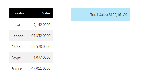
Switch to View mode and effect a change in the data to see the animation. The data label will be highlighted in color which then fades away after the specified duration.
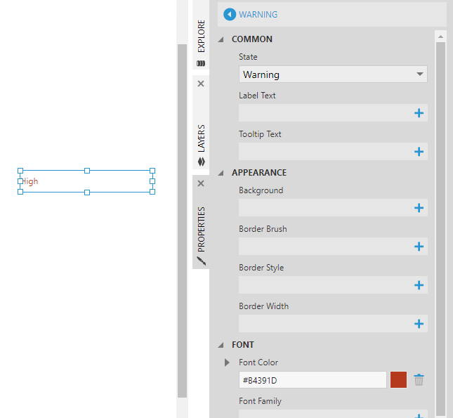
4.4. State styles
Go to Look Properties to edit or add a state style for a data label when you've defined states in your metric set.
Use these properties to change various properties for the data label when the data falls within each state, including the background, border, font, or the displayed text.
4.5. Allow HTML formatting
By default, if your data contains HTML tags such as <b> or <i>, these will be displayed as just tags in the data label and not interpreted as HTML elements.
If you want the HTML tags to be rendered as HTML by the browser, or if you want to enter your own HTML formatting into the Text property, go to Properties for your data label and enable the Allow HTML Formatting option.
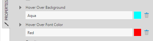
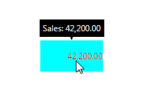
4.6. Data brushing
Go to Look Properties to edit or add background and font color. These properties will be applied when a user hovers over the data label during view mode.
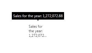
4.7. Fitting text
Text that does not fit in the data label is set to Truncate using an ellipsis (...) by default. This can be changed using the Overflow property in the Text tab to other options such as Hidden .
In reports, scorecards, and small multiples, the Auto Expand To Fit property is available in the Main tab of the Properties window.
When this option is enabled, the data label can automatically expand in height as necessary to fit longer text, and push content below it down to prevent overlap.
5. See also
- Report basics and concepts
- Designing an inventory report
- Building a scorecard
- Design tips for reports and scorecards
- Creating small multiples
- Formatting text
- Using the HTML Label component