Using a relationship diagram
1. Overview
The relationship diagram arranges items in your data based on the relationships between them in a freeform graph. Use it to discover unexpected links, group data into clusters according to their relationships, or add additional details or quantitative data (measures) on top of the structure it displays.
While this diagram can be used to display the hierarchical structure and grouping of any data you add to it, it is also capable of visualizing whatever forms of relationships might exist between values in your data by assigning Source and Target values.
2. Add a relationship diagram
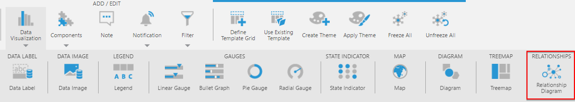
Using the Data Visualization or Re-Visualize option in the toolbar, select Relationship Diagram.
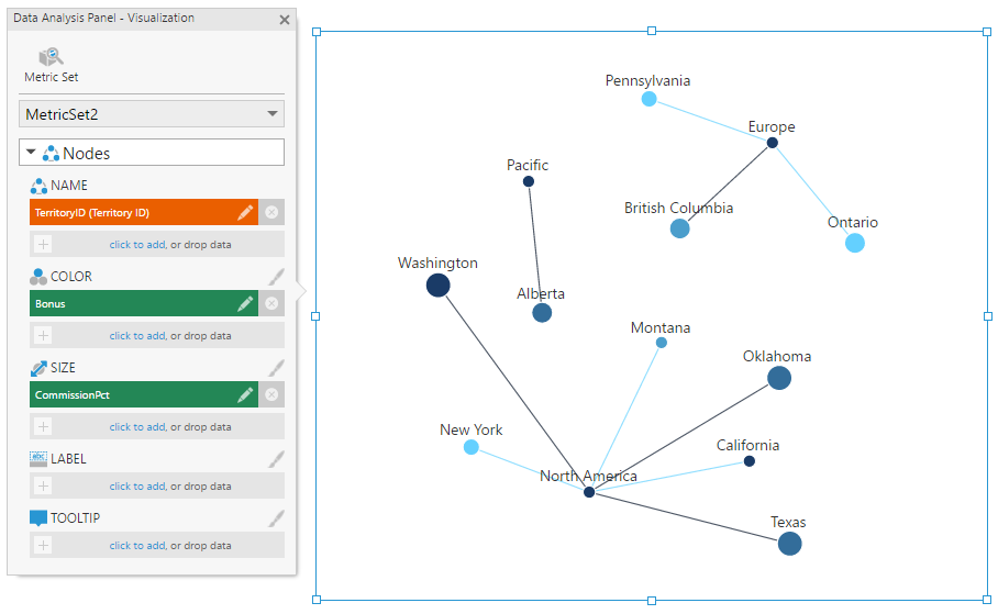
If you haven't already selected data, drag it from the Explore window onto Rows to determine what will make up the nodes (circles) of the diagram.
To select and visualize multiple levels from a multi-level hierarchy at once, click to edit the hierarchy in the Data Analysis Panel, then set the Top Level to be different from the Level.
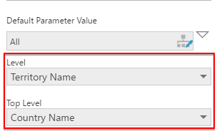
In our example below, the diagram now displays a tree-like arrangement based on the multiple levels of a hierarchy.
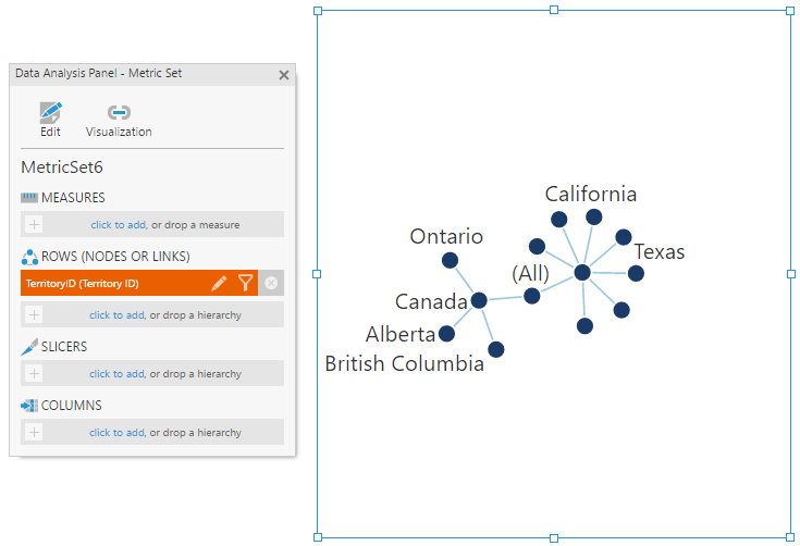
Instead of creating a multi-level hierarchy, you can add multiple hierarchies or columns of data.
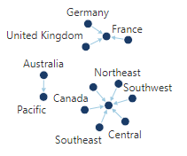
This type of diagram is known as a force-directed graph and is non-deterministic, which means it will initially be arranged differently each time it loads based on its current data.
You can zoom in and out, and click and drag nodes to re-arrange them (first click View in the toolbar if editing a dashboard or another view). Drag a child node to move it, or drag a parent node to move the whole cluster. When dropped, nodes will gravitate toward the parent node and the whole cluster will gravitate toward the center.
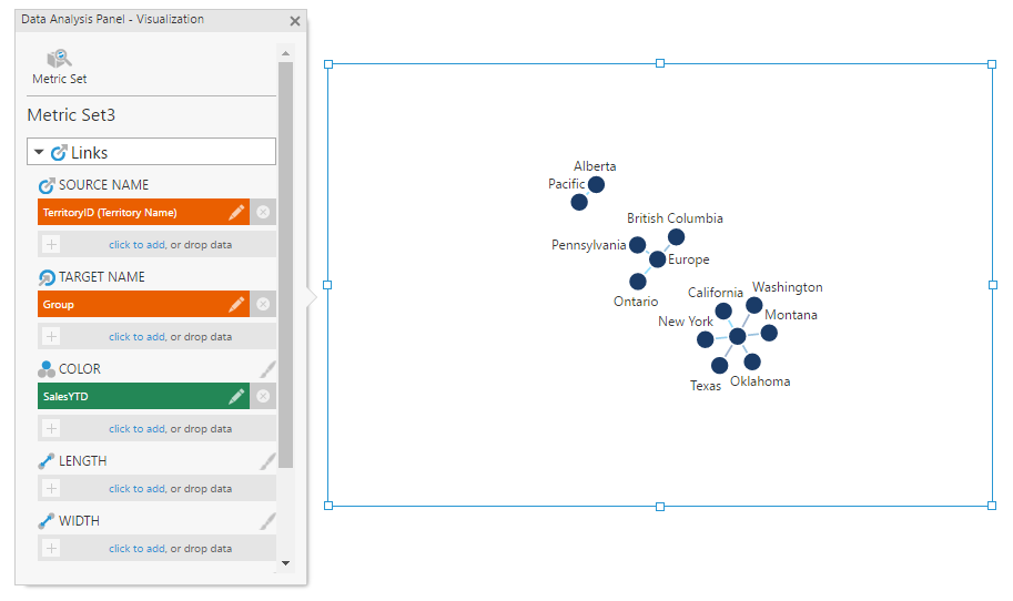
2.1. Display custom relationships
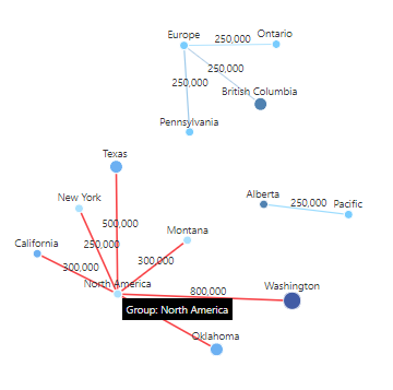
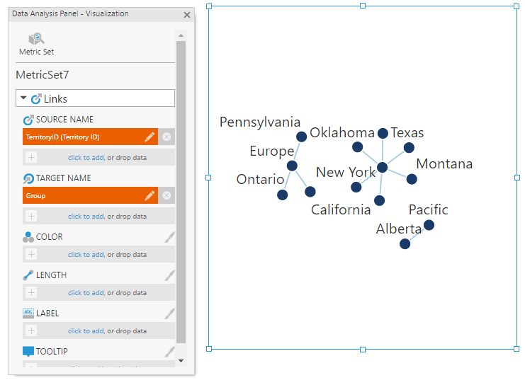
By default, the relationship diagram displays the hierarchical structure between the hierarchies and levels you've added. To display custom relationships between nodes, assign values as sources and other values as targets from rows of data that can identify pairs of nodes that each represent a relationship. For example, data corresponding with messages may have a from and to address.
To assign sources and targets, click the Visualization tab in the Data Analysis Panel.
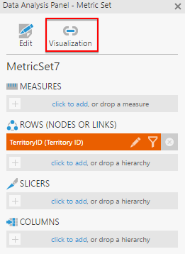
Remove any data not being used as a source from under Source Name (and add it if missing).
Drag data from the Explore window or click to add data under Target Name.
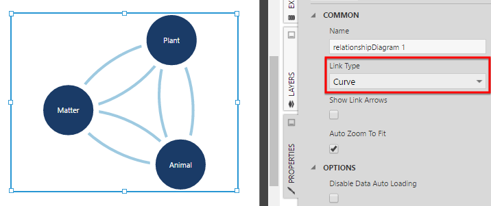
2.2. Link type
By default, links appear as straight lines connecting two nodes. If the relationships between items in your data have an associated direction, select the Show Link Arrows option in the Properties window. The links will be drawn as arrows from each source to the target.
If there are multiple links in your data between the same nodes (e.g., links in both directions), displaying them as straight lines will result in overlap and this relationship will be harder to see. To better visualize this type of relationship, change the Link Type property to Curve.
3. Change link appearance
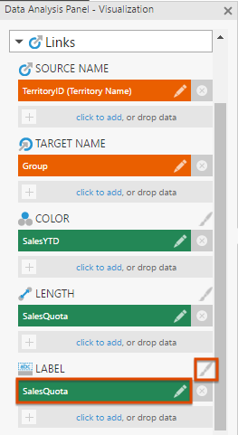
In the Data Analysis Panel's Visualization tab under Links, you can assign data under Color, Length, and/or Width to vary each link according to its values.
When data is assigned, color rules or size rules are created in the corresponding properties in the Properties window (e.g., an Auto Color Rule in the links' Color Rules). To change or customize these, click the brush icon next to the option in the Data Analysis Panel to go to the corresponding properties, or find them in the Look tab.
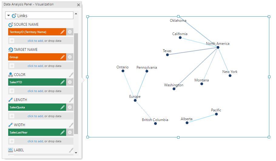
Length Rules apply length values to links, and Stroke Width Rules apply width values to links.
Color and size rules work the same as in other visualizations, such as charts. For more details, see Apply colors to data points or series using color rules.
4. Displaying node values and details
4.1. Adding a second metric set
If you have assigned data under Target Name to display custom relationships, the rows of your data each identify a pair of nodes. To display or visualize data for individual nodes, a second metric set must be added to the visualization.
When editing a metric set directly in the full-screen editor, it must be added to a dashboard or another view first before another metric set can be added. You can do this by choosing Add To New Dashboard in the toolbar.
In the Metric Set tab of the Data Analysis Panel, click the Add New or + button.
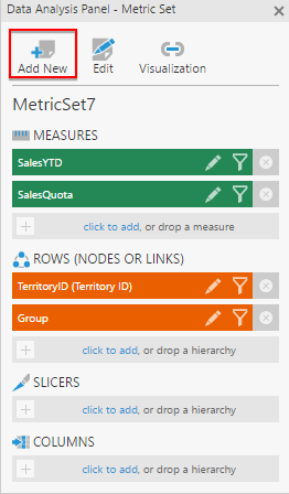
Drag data identifying each node onto Rows. These values should correspond with the values already used as source and target names.
Switch to the Visualization tab to confirm the data assigned under Name for the nodes. You can now assign this metric set's data as node color, size, label, or tooltip, as shown below, or use node state styles.
4.2. Change node appearance
In the Visualization tab of the Data Analysis Panel, you will find the Nodes section available when your second metric set is selected, or when you have a single metric set if no data was assigned under Target Name in the Links section.
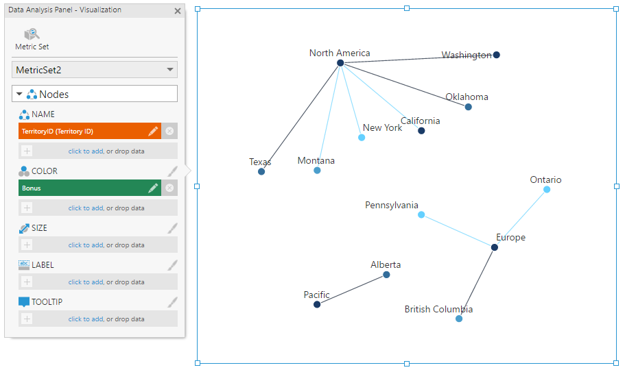
As with the links, color or size rules are created automatically when data is assigned as Color or Size. These can be changed or customized in the Properties window in the Look tab, and you can click the paintbrush icon next to the option in the Data Analysis Panel to go to the corresponding properties.
To display different images in each node instead of a color, assign data that can be used to find those images to Image, and optionally customize the corresponding Image Path property in the Look tab of the Properties window if your data does not already contain a full URL to the image. This property works the same way as the Image Path property in other visualizations, similar to how you can combine values from data with static text for labels and tooltips as shown in the following section.
5. Change labels and tooltips
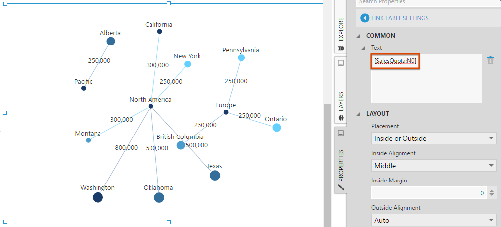
In the Text tab of the Properties window, you can customize the Label Text and Tooltip Text properties for both the links and the nodes.
These properties accept regular text, as well as keywords such as [Member] and [Level] for the hierarchy member and level caption respectively, which will be suggested for you as you edit the property. For additional information about available keywords, refer to the Formatting text article.
To display specific values from your metric set, you can enter keywords, or you can assign data to Label or Tooltip in the Visualization tab of the Data Analysis Panel.
After assigning data in the Data Analysis Panel, you can click the paintbrush icon next to the heading to open the corresponding properties.
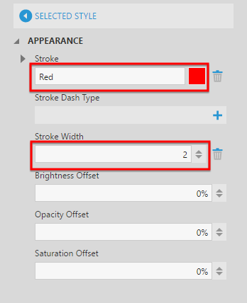
6. Selected styles
You can adjust how nodes or links appear when selected by hovering over them or through data brushing.
In the Look tab of the Properties window, click Selected Style in the applicable section.
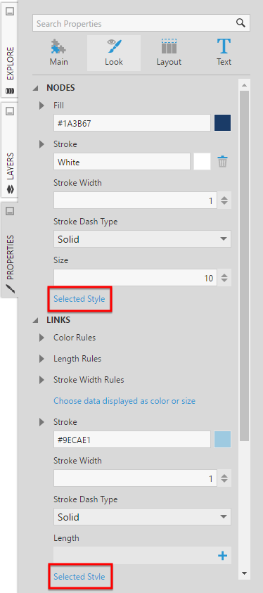
As an example, change the Selected Style for links to use Red strokes of a 2-pixel width.
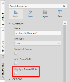
In the Main tab of the Properties window, select Highlight Related Links if all connected links should highlight at once when a node is selected.
If editing a view such as dashboard, switch to View in the toolbar before hovering over data in the diagram.