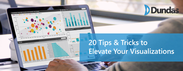
Learn Some Valuable Tips & Tricks to Take Your Visualizations to the Next Level

Dundas Senior Solution Architect, Jeff Hainsworth, demonstrates in this webinar some of his "cool tips and tricks” for creating professional, interactive dashboards in Dundas BI.
We’ll show you how to jazz up your dashboards and reports and make them more user friendly. Stay up to date on some cool ways to go about visualizing your data.
You'll learn how to:
- Enhance the user experience with loading overlays, interactive navigation and custom fonts
- Provide real-time feedback with real-time data and scrolling marquees
- Integrate with other web sources and visuals such as Bing maps
- Create what-if scenarios that every business users can use
Plus a few more surprises...
Presenter
Jeff Hainsworth, Senior Solutions Architect
Follow Us
Support